Jekyll Theme Primer Spec
Images
Basic syntax
Primer Spec automatically adds a subtle 1px border to images. In my opinion, the border helps with readability, especially for images whose background colors match the background of the page.
For instance, try viewing this image in the “default” theme in “light” mode:
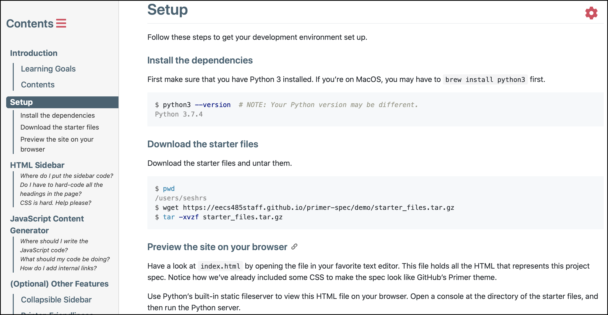
You can use either Markdown syntax or HTML syntax to define images.
Source code for basic image syntax
Markdown syntax:  Equivalent HTML syntax: <img src="./screenshot.png" alt="This image shows a screenshot of Primer Spec in the 'Bella' theme." />
Don’t forget the ‘alt’ text! It’s the only way fot visually-impaired users to understand the context provided by the image.
Opt-out of image borders
Simply add the no-border class to the image. For instance:

Source code for borderless images
Markdown syntax:
{: .no-border }
Equivalent HTML syntax:
<img
src="./screenshot.png"
alt="This image shows a screenshot of Primer Spec in the 'Bella' theme."
class="no-border" />
Supporting dark mode
Primer Spec supports built-in dark mode themes, which invert the background and foreground colors on the page. Primer Spec is able to invert most colors automatically, but cannot automatically handle images on your pages.
You’ll need to opt-in to these optimizations to better support your dark mode users. Primer Spec offers you two easy options to add dark mode support for your images:
- Option 1 (recommended): Ask Primer Spec to auto-invert your image!
- Option 2: Create two separate images (one optimized for light mode, the other for dark mode)
Option 1 (recommended): Auto-invert image colors in dark mode
If you add the invert-colors-in-dark-mode class to an image, Primer Spec will automatically invert the colors of the image when users view the page in a dark theme!
For instance, the following image changes colors in light mode and dark mode:

Source code for auto-inverted images
Markdown syntax:
{: .invert-colors-in-dark-mode }
Equivalent HTML syntax:
<img
src="./screenshot.png"
alt="This image shows a screenshot of Primer Spec in the 'Bella' theme."
class="invert-colors-in-dark-mode" />
Option 2: Show images only in certain theme mode
You can specify that an image is only shown in light mode or dark mode by appending #gh-dark-mode-only or #gh-light-mode-only to the end of an image URL.
| Context | URL |
|---|---|
| Light mode |  |
| Dark mode |  |
For instance, I created two different versions of the Primer Spec logo:
| Light mode | Dark mode |
|---|---|
However, I only want to show the correct version of the image depending on the theme mode. The following image dynamically displays the correct version of the logo when you change the theme between light and dark modes!
Source code for auto-switching logo
Markdown syntax:   Equivalent HTML syntax: <img src="./logo-light.svg#gh-light-mode-only" alt="Light mode version of Primer Spec logo" /> <img src="./logo-dark.svg#gh-dark-mode-only" alt="Dark mode version of Primer Spec logo" />
Diagrams
If you wish to upload images that represent flow charts or other diagrams, consider using Excalidraw or Mermaid instead. Check out the Diagrams demo for more information.